Well, it will come as no surprise that I’m getting dangerously close to the limit of my budget for this bedroom. So far I’ve bought one dud, which is not too bad, considering a dud or two are inevitable in projects like this.
So I’m trying to create a feeling, an experience, and a big change in my environment. I think I have achieved this, but now, because my sanctuary is so vastly improved, I’ve set my sights on another room, but because the money has run out, I’ve started up-cycling furniture.
To be honest, I didn’t want to start doing that now, on top of everything else, but we have to ask ourselves, when is the right time for anything, actually? Exactly, the right time is always the time you decide it HAS to be done.
Ok, so here are some photos of the bedroom, with the dressing table and canvas on the wall and another piece that I think works really well, that’s out of this shot.

Here you can see how the purple background and gold stencil colours are mixed in the eye, to create a kind of rich brown. This effect blends well with the earth colour of the walls. I’m so glad the curtains can remain the same, I really didn’t want to start looking for curtains. You can also see in the image above, an RSJ sticking out of the feature wall. This idiosyncrasy of the room was always a potential problem, but I think now, it somehow adds something strangely positive to the whole effect. I did worry quite a bit about how the RSJ would look, I’m so pleased its totally fine.
OK, so above is a rather blurry picture, I’m afraid, of the dressing table area I created. As you can see, I simply hung the Moroccan style mirror much lower than usual for it to also be the dressing table mirror and it works! The mirror really suits the room too.
I’ve changed the orientation of the dressing table, in that now I face the light, which is much better and I changed the chair I used to have, for this dinky stool in a very Moroccan colour. This means the dressing table and the door can comfortably co-exist. I’ve eliminated a small chest of drawers I used to have near the entrance of the room. I was so pleased I did that, because now when you come into the room, there is nothing in the way, just lots of space. Creating space is very important in room design.
The stool was about £50 which was OK, but I could have got something much cheaper at TK Max, if the colour wasn’t so essential. This time, the colour was utterly essential, because I needed a very warm colour to shake up that end of the room. I like that the dressing table is white and so practical. I didn’t want a traditional dressing table anymore. I had one of those before, I wanted something cozy, inviting and contemporary this time.
The opulent feature wall meant I needed to accessorise with vibrant jewel-like colours, so I found that gorgeous Vietnamese turquoise box at TK Max and the gilded budgies. I think the budgies are hysterical and I complemented them with a crystal tea light goblet thingy on the other side, to catch the light. The key themes are location, colour, space and de-cluttered peace.
The storage unit is from Ikea, my daughter chose it and the boxes, knowing the bedroom would be Moroccan soon. I was very pleased she did that, because I saw the potential in that storage unit as a dressing table right away and luckily found just the right mirror to complement the feature wall at the other end of the room.
Ok, so here is the blank canvas, still completely...um blank. Well, all I can say is, we’ve had such dark, dreary weather, no one in their right mind could conjure up the North African climate to get the colours right. Also, another thing happened. DH decided to become a little tiresome about what would actually be in the painting. I found this at first, interesting, then, somewhat annoying. He’s being funny about all this change I’ve imposed anyway, so I decided to give him some time to adjust. But its a little more tricky than that. I think that because the room is so successful, he’s now doing that very male thing, which is to become territorial.
In all honesty, the wall is so good, the painting I’m supposed to do is now....um scary! Not scary scary, but scary decisions, type of scary. Should it be very colourful, as I first imagined it, or should it somehow tie in with the effect of the feature wall? The jury is still out and my knees are knocking...
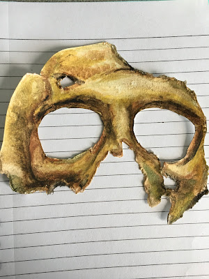
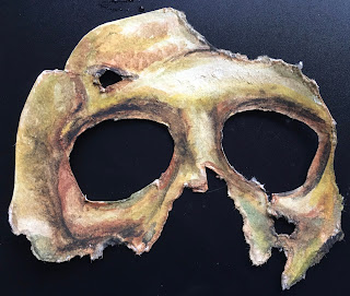
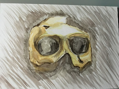
If I have to, I will wait until the spring to decide, because that’s exactly what happened when we were trying to decide on bathroom tiles. November’s low light conditions is no time to choose colours. What I think I will do though, is paint some pieces of paper in single colours and cut them up and move them around on the canvas, to see if they work or whatever. As I mentioned before, I have 4 images that I’m working from.
Ok, and here is the other piece that I‘ve put up. It looks even better on the wall than in the shop and does exactly what I wanted it to do, which is to remind me of Moroccan plasterwork and all its wonderful intricacies, it looks like stone carved into lace. I bought it in The Range, love that shop!
I bought all my paints, by the way, at Wilko. We do so love our darling Wilko over here. Their paints are fabulous and last year I did three rooms in Wilko paints, including painting the kitchen cupboards with chalk paint and sealing them with lacquer.
All of that turned out very well, even though for the kitchen I had to apply a whopping 160 coats of paint, luckily with a mini roller. (What’s really interesting, is my neighbour is now doing the same to her kitchen, but has called in a specialist company to do the work called ‘Funk up my furniture’. Love that name!)
So the piece below is quite heavy in weight, but not as heavy as the mirror. I’m the one round here that hangs everything, and this time I had to use a self-drilling nylon fixing that was going into a hollow wall. Again, Wilko are fantastic for those things, because they always have the max weight of a fixing printed on the pack. Takes the guess work out of so much stuff like this.
I am going to speak very quickly about drilling into walls... OK, so I will mark a cross, push in a bradawl, then use the thinnest drill piece to make a pilot hole. Then I will go in with a wider drill bit, then finally, with the drill bit I need for that fixing. This means I always manage to drill straight. Drilling straight is hard and that’s my solution anyway.
So, going back to the desk I’m up-cycling.
It’s an old Schrieber desk with matching chair made in GDR when I was 12. Goodness, that’s how old the thing is! I must confess, I wanted to donate it to charity, but I tested it fully for creaks, rocking and generalised weakness and ppl, let me tell you, there is NONE! Same for the chair. Now the thing is this, it looks really ‘industrial’ and that’s something I just adore and its another theme that’s very hot in interior design now. Industrial, distressed, aged, bashed up, concrete, rusted metal, you name it, the legacy of our industrial past is now fertile style-ground in the world of interiors.
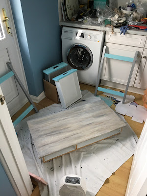
So, today I took it apart and hauled it downstairs, tomorrow I’m going to strip it and go at it with a wire brush like a thing possessed. Wish me luck ppl, there’s a lot hanging on the Schrieber revamp. It has two drawers and a colossal modesty board. I wanted to get rid of them, but I think the drawers could offer a chance for something interesting, perhaps in contrast to the treatment of the top? And the modesty board adds stability to the desk and the last thing I want is after all this work for the desk to start wobbling, creaking or to inadvertently feel flimsy. This is no flimsy desk, it weighs a ton and I can’t wait to give it a new lease of life...
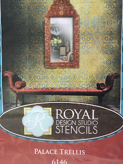
Oh, one last thing, here is a close-up of the stencil wall, because I wanted you to see the adorable purple up close..


