


Watercolour pencils, Metallic gel Ink & Graphite
The last time I did a colour drawing I was aiming at a kind of stitch diagram, whilst simultaneously stressing all the gold and silver threads and wires with gel inks. I cannot impress on readers enough just how much The Bag sparkles.
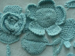
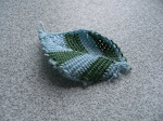
For this second flower however, I decided to take a different approach. As I’m not permitted to show you the actual image, I decided to make a different kind of drawing for each motif, and so, hopefully, if you put them together in your mind’s eye you can sort of imagine what it looks like.
Chromatic values
So with this next one I’ve tried to describe the overall tonality, which is rather dramatic as the flower is so complex, with 4 main sections, including a middle curling set of petals and finished off with 5 tent-stitched outer petals. What’s interesting about those is that they exhibit the same veining technique as used on leaves elsewhere on The Bag.

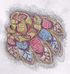
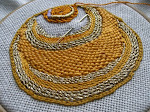
These next pictures, I hope, show off the gold and silver threads more clearly.
In terms of colour combinations this flower is really quite simple. The top is a brick-red surrounded in gold pearl purl. On to this are 3 mid-toned ‘sandy’ coloured mini petals that are pegged down and edged in gold Bullions. Then you have a row of very frilly, again ‘sandy’ petals, edged with gold pearl purl. After that there are 5 long petals, alternating between brick-red and indigo. Finally you have another 5 petals, this time tent stitched and edged in gold pearl purl.
Tent Stitched Petals
What’s interesting to note about these is that you can see they’ve tried to describe their shaded placement using darker tones of the same colour. However, for the red petals they’ve translated that as 2 shades of brown.
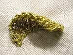
Renaissance Modelling
In modern painting methods you would indicate shade by incorporating complementary colours or making a particular colour ‘cooler’. I’m going to be using the terms ‘warm and cool’ more often from now on as I’ve been trained to do and for those of you that don’t understand those labels just remember it as: ‘cooler equals bluer and warmer equals yellower’. These terms are partly psychological and partly scientific as regards our understanding of colour.
The Bag doesn’t exhibit those modern colour codes, of course, and so that’s why I’ve made these drawings in keeping the Renaissance way of looking at colour, which would be to use lots of browns and vibrant under-painting for modelling.

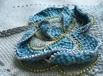
Here’s the same image with a sepia filter. Isn’t it a dramatic design!

As you can see, again, the middle sections of the flower are made of 3-d Detached Buttonhole but this time the stitching takes the conventional direction of back and forth coming down horizontally from the base line.
Circular Detached Buttonhole Flower Head….. (to be continued,..)
_________________
This post turned out to be really long, so I’ve decided to chop it into three. The other two parts will be looking at Circular Detached Buttonhole, which leads onto Detached Buttonhole increasing and decreasing technical nitty-gritty.
_________________
I visited the V&A Museum today (I wish I’d worn more comfortable shoes). It was truly AMAZING!
Thrilling and daunting in equal measure. The last time I went there they charged me £17.00 to get in, thankfully its free now. You’re invited to make a voluntary donation of £3.00.
I looked at everything on the second floor dating from 1500 to 1760. The Margaret Laton Jacket is NO longer on display.
One member of staff told me that was due to it being restored. But if you read the note in its display case it says its been removed to ‘reduce fading’??
They’ve put another jacket of the same period on display in its place, under the portrait of Margaret Layton (they use a ‘y’ over here). It’s obviously not as nice but still extremely good, even though its been taken apart. The front was apparently altered by adding a ton of spangles topped with beads, to wear to masked balls. Funny, I thought masked balls happened a lot later than that but there you go..
Oh, and I saw a Girdle Book there too. Two inches big just like my version from last month.
*The thing that struck me most about what I saw was the extremely thin silver and silver gilt threads they used for all that stuff. I was going to buy Silver Passing Thread Number 4 for the repro bag but I think I shall have to rethink that. Now, all the Lurex I have doesn’t seem quite so thin after all.
________________
FOR MINI-BOOK FANS: I’ve been working on the designs for 2 more mini-books. I have the materials for both of them but I just need to think through some construction details.
I’ve just returned from an excellent little holiday with my DH in Brighton. What a great place that is. In case you don’t know, Sussex University runs a very famous design course. As a result of that, the whole town is really arty. I just love all their cute shops along Kensington Gardens, Sydney Street and Upper Gardener Street. I got 101 more ideas for what to make out of DBH down there, I can tell you!!!
cya


Beth Lea, this is going to be just amazing.
ReplyDeleteAll i want to do is get my current stuff finished and out of the way so I can concentrate on this sort of work. Have only one butterfly square to go and think the cupcake quilt is going to be more basic maybee even be a first birthday present...and the green/blackwork butterfly is back in the cupboard...and the reef up on the shelf....
Hi Beth Lea,
ReplyDeleteYour work Article. are beautiful, all, I like them very much!
hot regards,
Wanda
Hi
ReplyDeleteYour work Art. are beautiful, all, I like them very much!
hot regards,
Wanda